Summary: In a world immersed in big data, how can we best show the messages gleaned from our findings? Enter data visualization and infographics -- artistically innovative ways to see the big picture as an actual picture.
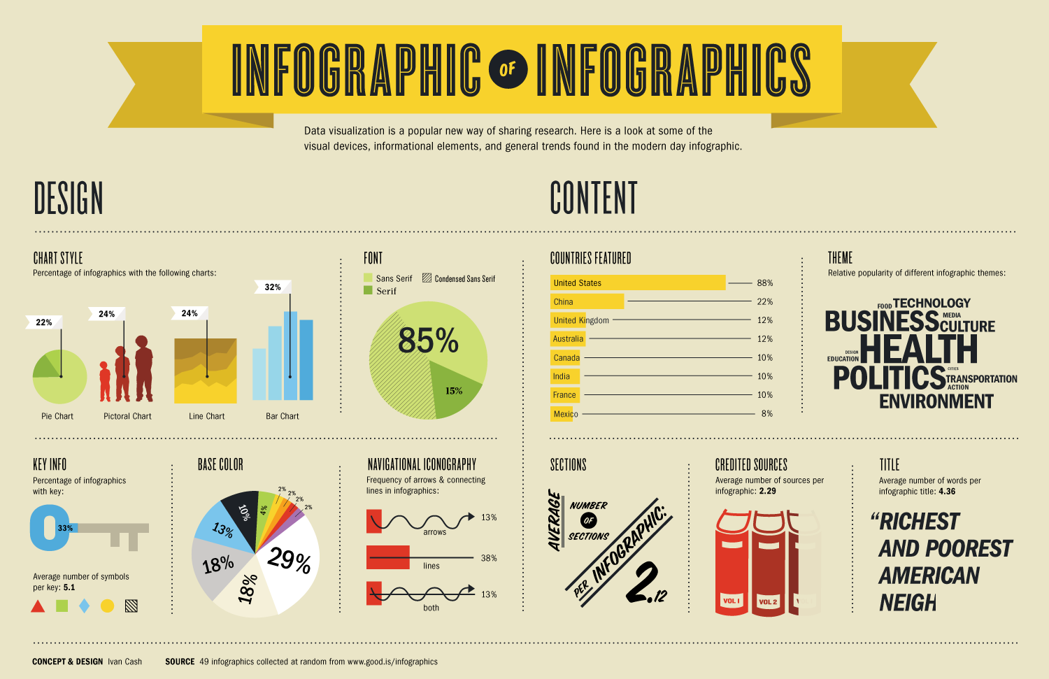
 |
| Image: Infographic of Infographics as found via Infographic List |
As found on Wikipedia, "data visualization is viewed by many disciplines as a modern equivalent of visual communication." Wikipedia defines "Infographic" as "graphic visual representations of information, data or knowledge intended to present complex information quickly and clearly. They can improve cognition by utilizing graphics to enhance the human visual system's ability to see patterns and trends. The process of creating infographics can be referred to as data visualization, information design, or information architecture." In a world filled with big data, analytics, and statistics, the products of data visualization lets us quickly see the big picture from all the details. Infographics are commonly used to sell a message in seconds. If a picture's worth a thousand words, high quality data visualization skills are priceless.
So, what makes a "good" infographic? Edward R. Tufte, deemed "The Leonardo da Vinci of Data Visualization" by the New York Times, wrote in The Visual Display of Quantitative Information (1983) that "Graphical excellence consists of complex ideas communicated with clarity, precision, and efficiency." Think about the information you need to present. What is the purpose of the data? What are the trends? Are you trying to emphasize a difference? Would you like to pinpoint a cause? If you showed this graphic to folks completely unfamiliar to the topic (e.g., your grandparents), then they should be able to understand your point.
The AAAS Science & Technology Policy Fellow Affinity Group for Federal Innovation and Research Evaluation (FIRE) has listed a few resources for thinking about data visualization on our website. For example, Andrew Abela created a Chart Chooser Diagram that lets you select a chart based on the message that you want to send. John Schwabisch has a poster called "the graphic continuum," which outlines some of the methods for displaying different types of data. Ann K. Emery gave a talk earlier this year to The Washington Evaluators and described the Data Visualization Checklist, which she created with Stephanie Evergreen, who's teaching a class through The Evaluator's Institute in Washington, DC during January 2015. This checklist includes guidelines for the number of words to put in a title, how to play a hierarchy, how to label data, etc. These are simple starting tips, but definitely good ones to follow when creating a presentation or presenting data.
Interestingly, some agencies are historically very text-prone. For example, some colleagues at the Department of State showed me a fairly typical email that alerted employees about a huge upcoming event by listing names of streets and intersections that would be closed. By contrast, the Washington Post had a map that highlighted the streets to avoid. A simple idea, but it was more effective in getting the message across.
Many, many, many blogs showcase excellent examples of infographics. Some examples include:
- Randy Krum's Blog has examples based on filmography, 20th century death, beer colors, good tools for making your own infographics, and much more.
- FlowingData picks out projects from genealogy to shooting patterns for the Washington Wizards to the most cited research papers.
- CreativeBloq shows animated infographics, comic book characters, and fonts.
- ThreeStory Studio showcases videos and interactive media alongside 2D infographics.
 |
| Image: The Graphic Continuum from John Schwabish as found via Cool Infographics |
No comments:
Post a Comment